

How to access it
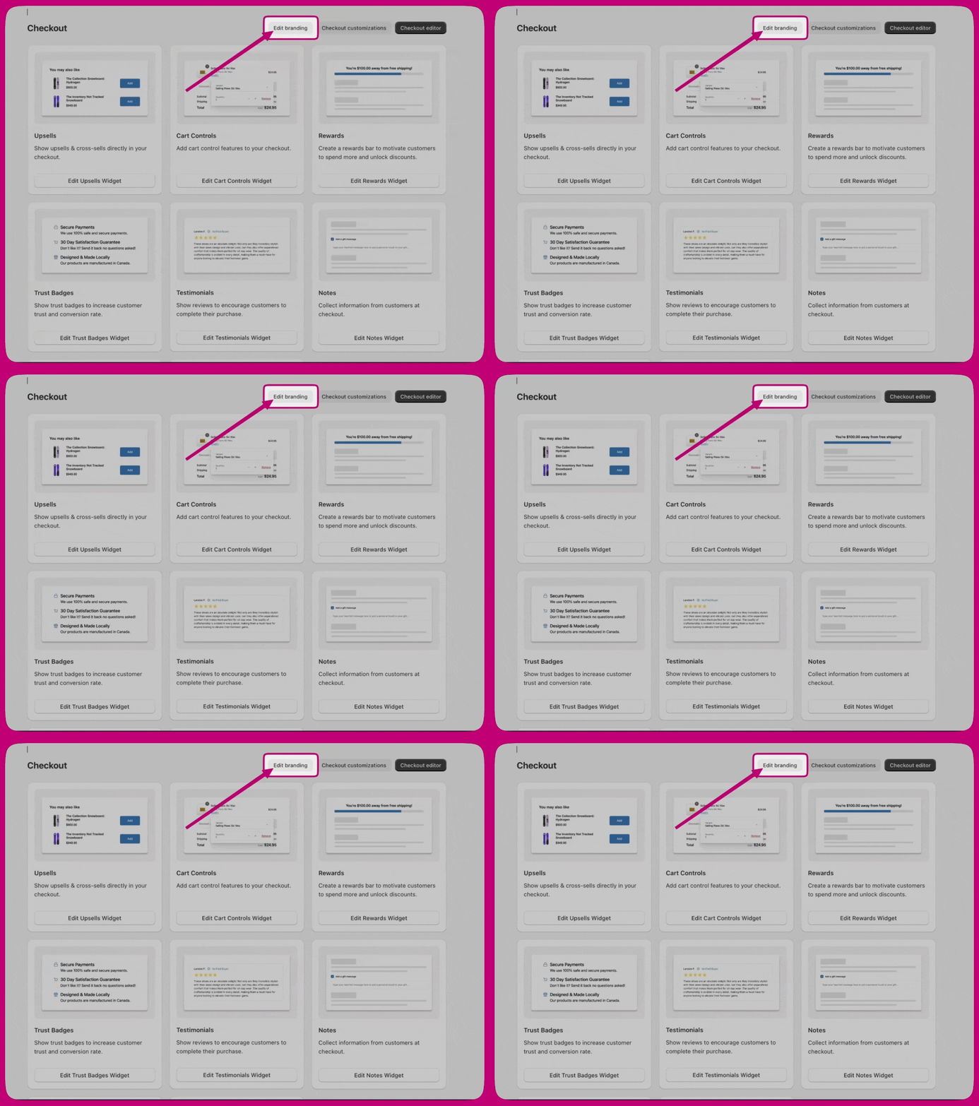
Open the Checkout dashboard in Aftersell and click Edit branding at the top of the page.Editing branding here requires a Shopify Plus plan. Shopify only lets apps read and write checkout branding on Plus, so on other plans these settings cannot be saved. If your store is not on Plus, make the same changes in the Shopify checkout editor instead: Settings → Checkout → Customize in your Shopify admin.
Design system
Design system settings are the foundation. Components across the checkout inherit from them unless a more specific setting overrides them.Global colors
Your brand and system colors, used across your store and post-purchase experiences. Components use these colors when no color scheme is set. Brand colors- Brand – your primary brand color.
- Accent – used for interactive and highlighted elements.
- Decorative – used for supporting decorative elements.
- Success – confirmation states.
- Warning – cautionary messages.
- Critical – errors and alerts.
- Info – informational messages.
Surface and button colors are not set here. They live under Advanced > Color schemes.
Typography
- Font size – set the Base size and the Scale ratio that derives the rest of the type scale.
- Primary font – used for most components such as regular text, buttons, and form controls. Choose a Font family, Base weight, and Bold weight.
- Secondary font – used for heading components, with the same three controls.
Corner radius
Sets the shared corner radius values that buttons, form fields, containers, and other components reference. You define three sizes: Small, Medium, and Large.Customizations
Buttons
Configured separately for Primary buttons (the main action on a page) and Secondary buttons (supporting actions). Each has:- Corner radius – Small, Medium, Large, or None (squared).
- Background – Solid or None.
- Vertical padding and Horizontal padding.
- Show border.
Button colors are inherited from color schemes. If no scheme value is set, global colors are used.
Form fields
Applies to all supported field types:- Corner radius
- Label position – Inside or Outside.
- Show border
Product thumbnails
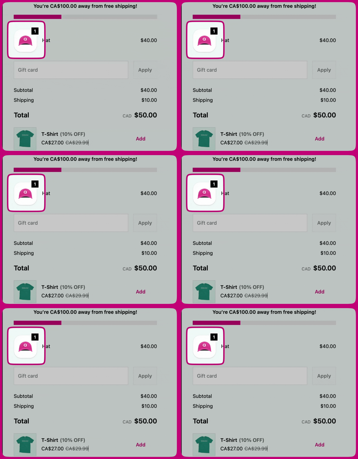
Controls how product images appear on the page:- Show border
- Border radius
- Fit
- Badge background color – Accent (scheme accent color) or Base (scheme base color).
Header
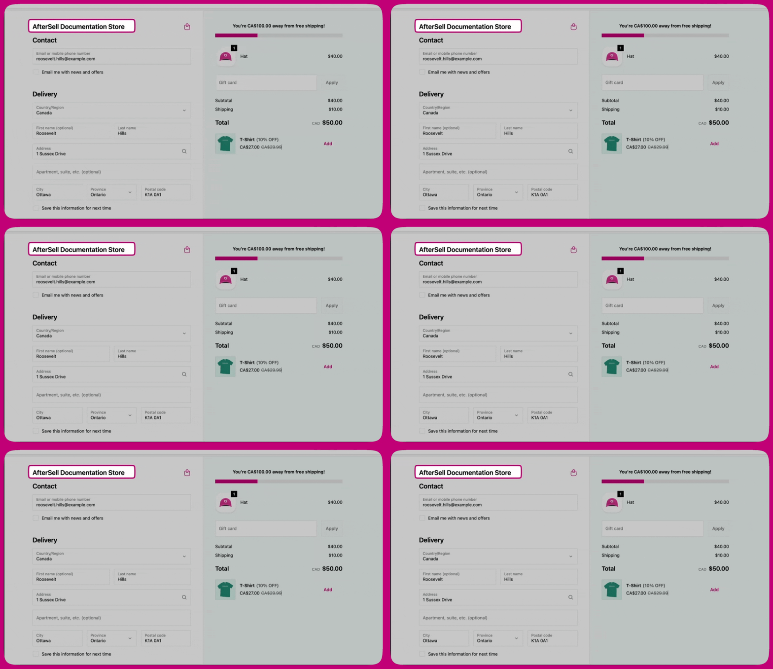
- Layout – Placement (Top bar, Left section, or Right section) and Alignment (Left, Center, or Right).
- Container – Padding, Color scheme, and Show divider.
Content area
Controls the Divider between the main and order summary areas: Show divider, Border style, and Border weight.Main area
- Section containers – the background and border wrapper around each section: Background, Show border, Border style, Border weight.
- Section dividers – the lines shown between sections.
Order summary
- Container – the Color scheme applied to the overall order summary container.
- Section dividers – Show divider, Border style, Border weight.
- Section containers – the background and border around each section: Show border, Background, Border style, Border weight, Color scheme, Corner radius, Padding, and Shadow.
Footer
- Layout – Placement and Alignment.
- Container – Show footer content, Padding, Color scheme, and Show divider.
Advanced
Color schemes
Color schemes are reusable sets of surface, text, and button colors that other sections point at. Two schemes are available:- Scheme 1 - Main area
- Scheme 2 - Supporting areas
- Buttons – used for the main payment button and secondary actions. Primary button and Secondary button are configured separately, each with its own default and hover state.
- Form controls – used for text fields, dropdowns, and choice lists.
- Base surfaces – the surface background, body text, and supporting roles: border, accent (links and focus), decorative (subtle highlights), and icon color.