Funnel-wide widgets
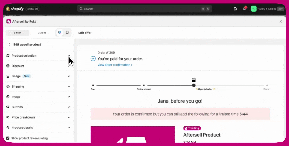
Progress Bar
The Progress Bar shows customers where they are in the post-purchase flow. When enabled, the progress bar appears on all upsell offers within the funnel. Any changes made to the progress bar apply across the entire funnel.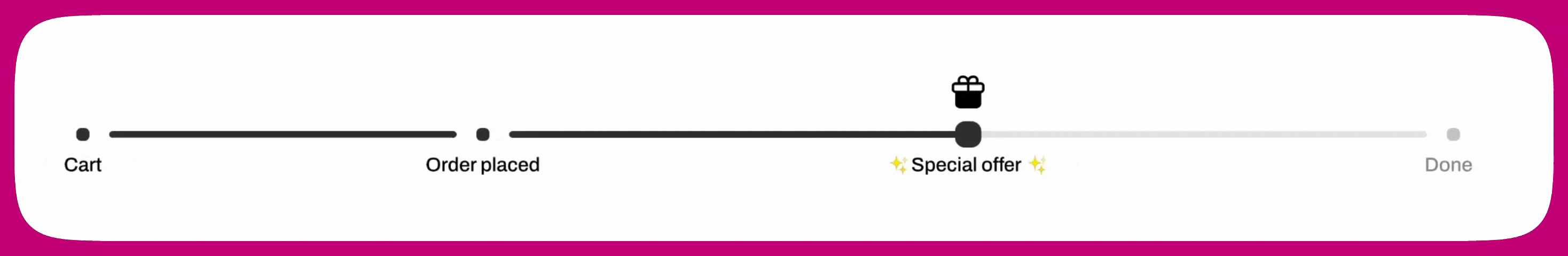
- Toggle the progress bar on or off for the funnel
- Choose a display style:
- Minimal
- Minimal with labels
- Maximal
- Select a light or dark appearance
- Adjust top and bottom padding to control spacing
Offer-level widgets
Offer-level widgets control the content and behaviour of an individual upsell offer. These widgets define what the customer sees on a specific upsell step, including messaging, urgency, product information, pricing details, and actions. Each offer in a funnel can be customized independently using offer-level widgets, allowing you to tailor the experience at every step. These widgets include:Text
Timer
Upsell Product
Product Selection
Discount
Badge
Shipping
Image
Buttons
Price Breakdown
Product Details
Variants
Layout
Video
Testimonials
Text
The Text widget is used for headings and supporting copy throughout an offer. It supports a heading and optional body text, with controls for font size, color, weight, alignment, strikethrough, and spacing. Use the dynamic variable{first-name} to personalize messaging for each customer.
Timer
The Timer widget adds urgency by displaying a live countdown. While the timer is running, the offer remains visible. When the timer reaches zero, the upsell offer automatically disappears and the customer is moved forward in the funnel.Upsell Product
The Upsell Product widget is the heart of the offer. It defines which product is being shown and acts as the container for all product-related widgets below. Everything that follows is configured within this widget.Product Selection
The Product Selection widget controls which product is shown in an upsell offer. You can select a fixed product or dynamically determine the upsell product based on the customer’s original order, allowing for both static and adaptive upsell experiences.Product type options
- Specific product
Always displays the same product in the upsell. - Automatic upsell
Dynamically selects a product using predefined upsell logic. - Most expensive in cart
Uses the highest-priced item from the customer’s original order. - Least expensive in cart
Uses the lowest-priced item from the customer’s original order.
Changing the product
The selected product appears at the top of the widget. To change it:- Click Change product
- Select a product type
- Choose or confirm the product
Identifying products with identical names
If your store has multiple products or variants with the same title, enable the Show IDs toggle in the product picker to display the numeric Shopify product ID and variant ID beneath each name. This makes it easy to confirm you are selecting the correct product. The Show IDs toggle is available on the Product tab of the picker and is off by default. It is not available on the Collection tab.Discount
The Discount widget applies and displays promotional pricing. You can choose between a percentage (%) discount or a fixed dollar ($) discount. Custom discount text can be added if desired, and the discount can either reference the product’s compare-at price or ignore it.Bulk discount shortcut for multi-product offers
For multi-product and collection offers, a Discount section appears directly in the Upsell Products widget settings — below the product selection area. This gives you a faster way to set or update discounts across multiple products without opening each product’s individual settings. The section is collapsed by default. When you expand it:- A list of all products in the offer is shown, each with a checkbox and a badge displaying its current discount (for example,
17% offor$18.00 off). - Select the products you want to update using the checkboxes. All products are selected by default.
- A pill below the list shows how many products your changes will apply to.
- Use the discount type and value fields to set the discount. Changes apply only to the selected products — unselected products keep their existing discounts.
Mixed discounts across products
When selected products have different discount settings, the fields show placeholder text to indicate the variation:- If products have different discount types (for example, some are % off and others are $ off), the type selector shows Mixed.
- If products have different discount values or types, the value field shows Multiple values with a note that entering a new value will override each selected product’s current discount.
Info icon on product rows
An info icon (i) appears beside a product’s discount badge when that product has additional discount settings configured — such as a custom discount title, a compare-at price, or a subscription discount. Hovering over the icon shows a summary of those extras.Badge
The Badge widget highlights key product attributes such as popularity or urgency. You can select a predefined badge label, choose from multiple visual styles, include an icon, and control where the badge appears in the offer or directly on the product image.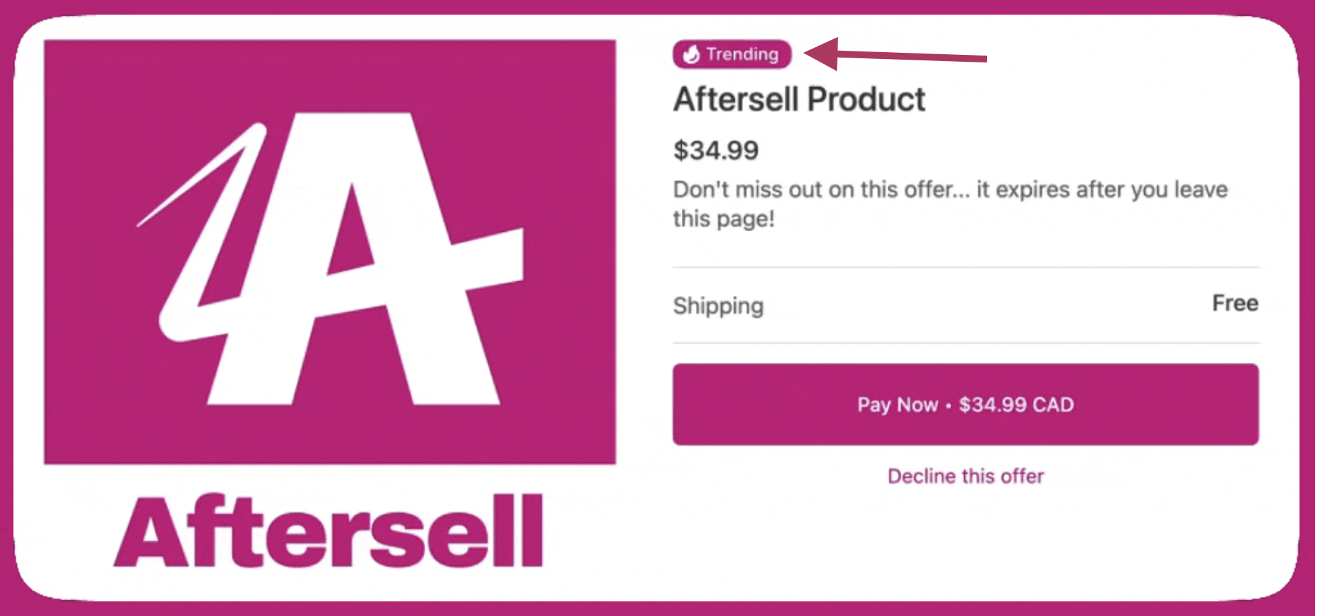
Shipping
The Shipping widget controls how shipping costs are communicated. You can either offer free shipping or charge for shipping by setting a specific shipping price.Image
The Image widget controls how product images are displayed. It includes options to adjust the main image size, add a border, enable an image carousel, and upload a custom product image from Advanced image settings.Language
The Language section controls which language is used for all system text in the offer, including button text, subscription labels, pricing labels, and other non-editable strings. Select a language from the Language dropdown to automatically translate system text for that offer. Aftersell supports 32 languages. This setting does not affect badges or custom text fields — only system-generated text is translated.Buttons
The Buttons widget controls how customers accept or decline an upsell during checkout. You can customize how the buttons behave and appear, including:- Selecting the default accept button text
- Requiring a confirmation click before an upsell is accepted
- Changing the decline button style (for example, button or link)
- Adjusting button alignment and width
- Adding optional supporting text above or below the buttons, with styling controls and dynamic variable support
Button text
You can configure the accept button text for your post-purchase offers using the Default accept button text dropdown. The available options depend on the offer type: Standard offers:- Pay Now - Displays “Pay Now • [product total price]” (or “Add Now • Free” for free products)
- Accept Offer - Displays “Accept Offer” regardless of price
- Upgrade Subscription - Displays “Upgrade Subscription” (default for new Subscription Upgrade offers)
- Accept Offer - Displays “Accept Offer” regardless of price
- Pay Now - Displays “Pay Now • [product total price]” (or “Add Now • Free” for free products)
Button layout options
You can also control the position of the accept and decline buttons relative to each other. The following layouts are supported:- Accept above decline - Displays the accept button above the decline option
- Decline above accept - Displays the decline option above the accept button
- Accept beside decline - Displays the accept and decline buttons side by side
Price Breakdown
The Price Breakdown widget adds clarity around pricing. It can display shipping and tax, include extra details such as subtotal and discounts, and be aligned or positioned near the payment buttons for maximum clarity.Hide shipping adjustment line
When your offer is configured as a replacement upsell (using the “Replace item in original order with upsell” setting), the price breakdown includes a Shipping adjustment line that reflects any shipping cost difference between the original and replacement product. You can suppress this line using the Hide shipping adjustment line checkbox, which appears in the Price Breakdown section only when a replacement upsell is configured. This setting is off by default, so existing offers are unaffected.- When checked, the shipping adjustment line is hidden from the customer’s price breakdown.
- When unchecked, the shipping adjustment line is shown as normal.
Product Details
The Product Details widget controls how key product information is presented. It supports product review ratings (automatically hidden if no reviews exist), an optional quantity selector, and the ability to skip the offer if the product already exists in the original order. Product titles and prices are fully stylable and support some dynamic variables including{product}, {original-price}, {current-price}, {savings}, and {savings-line}.
An optional offer description can be added to reinforce value or urgency.
Product review star colors
When Show product reviews rating is enabled, you can customize the colors of the star rating display:- Star color — the color of filled (active) stars. Defaults to
#fdcc0d(yellow). - Empty star color — the color of unfilled (inactive) stars. Defaults to
#d1d5db(light gray).
Quantity selector presets
When the quantity selector is enabled, you can configure a preset quantity to control how many units are shown or allowed when the offer is displayed. The following preset options are available:- Fixed — Sets a specific quantity that the customer starts with. The quantity selector is hidden and the customer cannot change the quantity.
- Percentage of purchased quantity — Sets the quantity as a percentage of the number of units the customer originally purchased.
- Minimum quantity — Sets a floor on the quantity. The customer starts at this value and can increase from there.
- Maximum quantity — Sets a cap on the quantity. The customer starts at 1 and cannot increase past the configured maximum (up to 20). A message is shown to the customer indicating the maximum quantity for the item.
Description position
For single-product offers, you can control where the product description appears in relation to the CTA buttons:- Default (above buttons) - The description appears above the accept and decline buttons
- Below buttons - The description appears below the accept and decline buttons
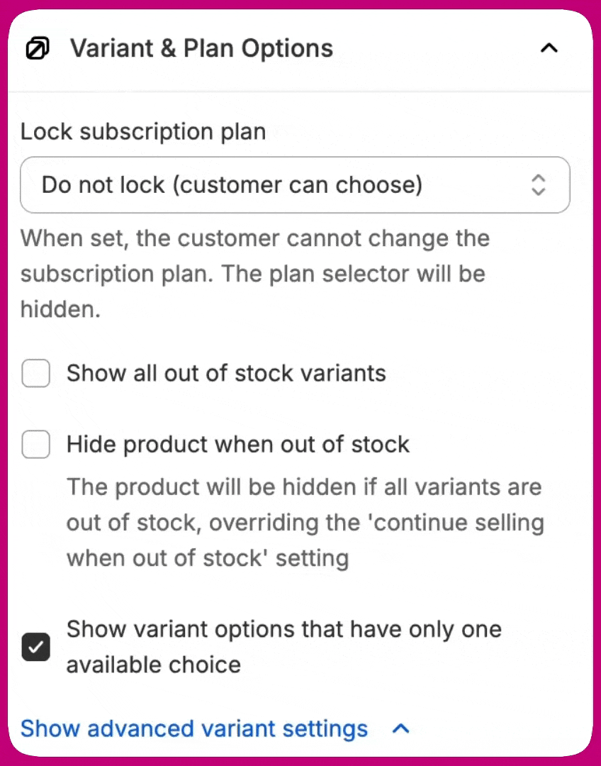
Variant & plan options
The Variant & Plan Options widget controls variant visibility, selection, and subscription plan locking. You can show or hide out-of-stock variants, hide the entire product if all variants are unavailable, and control whether variant options with a single choice are shown. Advanced settings allow you to hide the variant selector entirely. Variant preselection options include Smart matching to the initial purchase, Unselected, requiring the user’s selection or First available variant. For products with multiple variant options, all options are displayed and an in-stock variant is preselected when available; out-of-stock options are shown as unavailable. For products with a single variant option, out-of-stock options are hidden.Subscription plan locking
When offering subscription products with multiple subscription plans, you can lock the offer to a specific plan. This prevents customers from changing the subscription plan during the post-purchase experience, ensuring they receive the exact subscription option you’ve configured. To lock a subscription plan:- In the Variant & Plan Options section, locate the Lock subscription plan dropdown
- Select a specific plan from the dropdown
- The plan is now locked — customers will see the plan name as static text instead of a changeable dropdown
- Customers see the plan name displayed as text
- The plan selector dropdown is hidden
- Customers cannot change the subscription plan
- If the locked plan is no longer available in Shopify, the offer gracefully falls back to showing all available plans
Variant selector position
You can control where the variant selector appears in relation to the CTA buttons:- Above CTA buttons (default) - The variant selector appears above the accept and decline buttons
- Below CTA buttons - The variant selector appears below the accept and decline buttons
- Variant selector first - The variant selector appears before the product description
- Description first - The product description appears before the variant selector
Layout
The Layout widget controls the overall structure and spacing of the upsell. You can choose between a single-column or two-column layout, adjust the maximum layout width, and fine-tune top and bottom padding to create a clean, readable experience.Video
The Video widget adds a clickable thumbnail to an offer that opens a hosted video player in a new tab, with a styled backdrop and a button to return to the upsell. The video plays in a new tab rather than inline, so the upsell offer stays open in the original tab. The widget also supports a backdrop color to match your brand or focus attention on the player, and layout settings for alignment (left, center, right), and top and bottom padding. To preview the customer experience, click the thumbnail in the offer preview in the editor. The hosted video player opens in a new tab exactly as it will on the storefront, so you can confirm the thumbnail, CTA, and close behaviors before publishing.Video source
The widget supports two sources:- YouTube URL — paste any standard YouTube watch link.
- Direct video URL — paste a link to a hosted video file (for example, an MP4 you host on your own CDN).
Thumbnail and watch-video CTA
Upload the image customers will see in the offer before they open the video. A watch-video CTA is automatically placed on top of the thumbnail to draw attention to the play action. You can style the CTA label text to match your brand. Thumbnails are not auto-generated from the video — they must be uploaded. You can also upload a separate mobile-only thumbnail. When set, the mobile thumbnail is shown on mobile devices and the default thumbnail is used on desktop, so you can tailor the image for each screen size.Autoplay
The Autoplay toggle controls whether the video starts playing automatically when the hosted player opens. When autoplay is enabled, the video starts muted. Most modern browsers block autoplay of videos with sound until the customer interacts with the page, so playing muted is required for autoplay to actually fire reliably. Customers can unmute the video using the player controls once it has started. If you would rather have audio play from the first frame, leave autoplay off and rely on the customer to manually click play on the video.Closing the video
There are three ways for a customer to close the hosted player and return to the upsell offer:- Back to offer button — a button below the player that closes the tab and returns to the upsell.
- Double-click anywhere — double-clicking anywhere on the backdrop closes the player.
- Auto-close on end — when the video finishes playing, the player closes automatically.
Testimonials
The Testimonials widget displays real product reviews on your post-purchase offer to build trust and reinforce the customer’s decision to accept an upsell. Reviews are pulled from your connected review app. The widget appears in the offer editor picker as “Testimonials” with a star icon. To use this widget, you must have a review app connected in Settings > Product Reviews. Supported apps include Judge.me, Klaviyo, Okendo, and Yotpo. See Review app integrations for setup instructions.Selection modes
The Testimonials widget supports two modes:- Manual — You select a curated pool of reviews to display. Reviews are shown in the order you saved them.
- Dynamic — Reviews are automatically pulled from your review app’s synced cache based on the products in the upsell offer. Reviews are keyed to the offer’s products, not the customer’s original order.
Configuration options
- Review app — Select which connected review app to pull reviews from.
- Mode — Choose Manual or Dynamic.
- Minimum rating — Set the minimum star rating for reviews to display (for example, 4 stars and above).
- Display toggles — Show or hide individual review elements:
- Star rating
- Review title
- Reviewer name
- Review date
- Verified buyer badge
- Truncate review text — Set a maximum character length for review text. Reviews exceeding this limit are clipped with an ellipsis.
- Max reviews to show — Set how many reviews appear, from 1 to 3.
- Layout — Arrange reviews Horizontal (side by side) or Vertical (stacked).
- Padding — Adjust spacing around the widget.
Dynamic mode and review syncing
In dynamic mode, Aftersell imports reviews from your review app and stores them so they can be displayed on the offer. The first import happens automatically within 24 hours of connecting your review app, and then once a week after that. To import reviews immediately, go to Settings > Product Reviews and click Sync now for your review app.Verified buyer badge
When the verified buyer badge is enabled, a “Verified buyer” label is shown on qualifying reviews. This label is automatically translated into the language set for the offer and supports 32 languages.Adding additional widgets
Widgets can be added either above or below the Upsell Product widget, allowing you to control the flow of information before or after the product itself. Additional widgets that can be added include:- Image - Display a supporting image to visually reinforce the offer.
- Text - Add supporting text to communicate key messages.
- Text & Image - Combine text and visuals to highlight value or explain the offer.
- Extra Buy Button - Add an additional call-to-action to encourage offer acceptance.
- Trust Badge - Display trust signals such as guarantees, security, or credibility indicators.
- FAQs - Answer common customer questions to reduce friction and increase confidence.
-
Video - Display a thumbnail that opens a hosted video player in a new tab, with a styled backdrop and a button to return to the upsell.
Video widget settings:
- Play button label - Optional text displayed on the thumbnail overlay alongside the play circle (for example, “Watch now”). This field is disabled when the hide play button overlay toggle is on.
- Hide play button overlay on thumbnail - When enabled, the thumbnail displays only your poster image with no play circle or label drawn over it. Use this if your poster image already includes its own call-to-action artwork. When disabled (default), the play circle and optional label are rendered on top of the poster.
- Choose whether you want the widget to appear above or below the Upsell Product widget
- Click Add widget in the selected section
- Select and configure the widget you’d like to include
To learn more about what post-purchase offers are, how they work, and how to start using them with Aftersell, take a look at this article for more information.
The behavior and appearance of widgets are limited to the configuration options available in the editor.
Further customizations are not supported due to Shopify limitations.