

General
Inherit Fonts from Theme
This setting allows Upcart to use the fonts defined in your Shopify theme settings. To view your current font choices, open the Shopify Theme Editor and navigate to the Typography section.🚧 Cart Preview 🚧
Fonts inherited from your theme will not appear in the Upcart preview window, but they will display correctly on your live storefront.Show Strikethrough Prices
Enable this setting to show a strikethrough (also known as the Compare At Price) price beside each item in the cart. This reflects discounted pricing, similar to your product pages.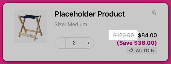
Colors
Background Color
Sets the main background color of the cart, excluding the footer and upsell cards.Cart Accent Color
Controls the background color of the cart footer and upsell item cards.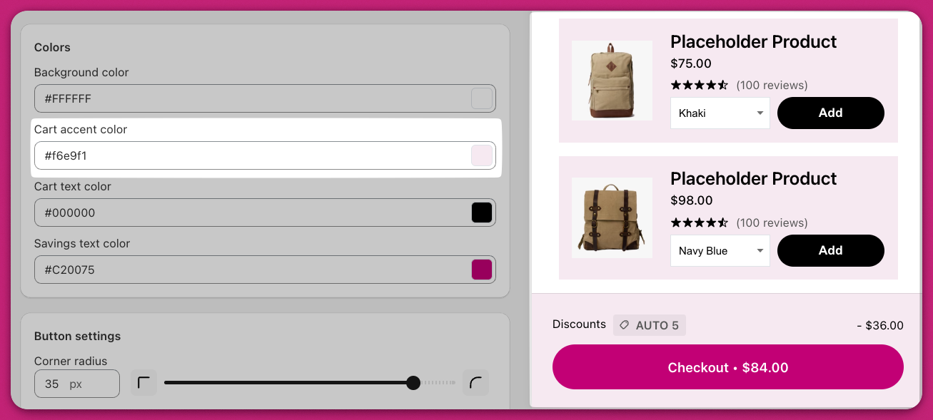
Cart Text Color
Defines the color for all cart text, except for button text and savings text, which are controlled separately.Savings Text Color
Sets the color of the savings text shown beneath the product price.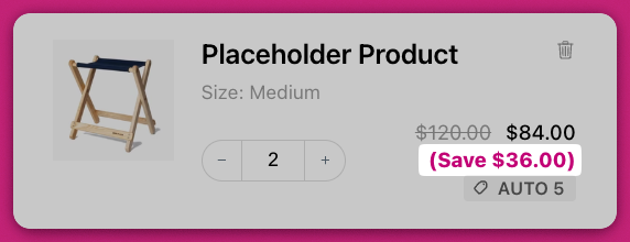
🚧 Cart Preview 🚧
The preview editor may not reflect final styling precisely. Your store’s theme may include custom CSS that affects text size or color. Always verify changes on your live storefront.Button Settings
Upcart offers advanced button styling options, including specific customization for the checkout button. This includes methods for CSS adjustments and integrating Shopify’s branding tools.Corner Radius
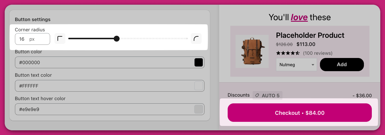
Adjusts the roundness of button corners. For example:- 0 pixels creates square buttons
- Higher values create more rounded or pill-shaped buttons For instance, setting a radius value of
0creates sharp, square corners, while increasing the radius to9999pxresults in pill-shaped buttons.
Button Color
Sets the background color for all buttons in the cart, including:- Checkout button
- Upsell “Add to Cart” button
- Discount “Apply” button
- Subscription upgrade button You can customize these buttons’ color through the Cart Editor. For further advanced customizations like CSS modifications, refer to the advanced customization section.
Button Text Color
Specifies the text color used in all cart buttons.Button Text Hover Color
Controls the color of button text when a customer hovers over it with their mouse. For example, if set to green, the text will turn green on hover.Advanced CSS Customization for Checkout Buttons
For significant design changes, you can use Custom CSS code to modify the checkout button:- Access
Settings > Custom CSSin your Upcart dashboard. - Utilize the relevant CSS selector, such as
.checkout. Example CSS snippets: To create a pill-shaped button:To add a black border:Replace.checkoutwith the actual CSS class for your button. Additional styling includes hover effects, padding, text colors, or fonts.
Integrating Shopify Branding for Button Customization
If you’re using Shopify, you can update your checkout button design via Shopify’s admin:- Log in to your Shopify Admin.
- Navigate to
Settings > Checkout > Customize. - Utilize branding options to modify the font, roundness, or colour for a seamless design.
