

Overview
The Header Module allows you to customize the top section of your Upcart drawer with your brand’s logo, title text, layout, background color, and close button. Visual controls make it easy to style your header without needing to define exact pixel sizes.Header Module Settings
General
Height switches between Slim and Tall to control the vertical space. Bottom border is either None or Thin. Background color takes a hex code or the built-in colour picker, and supports transparency.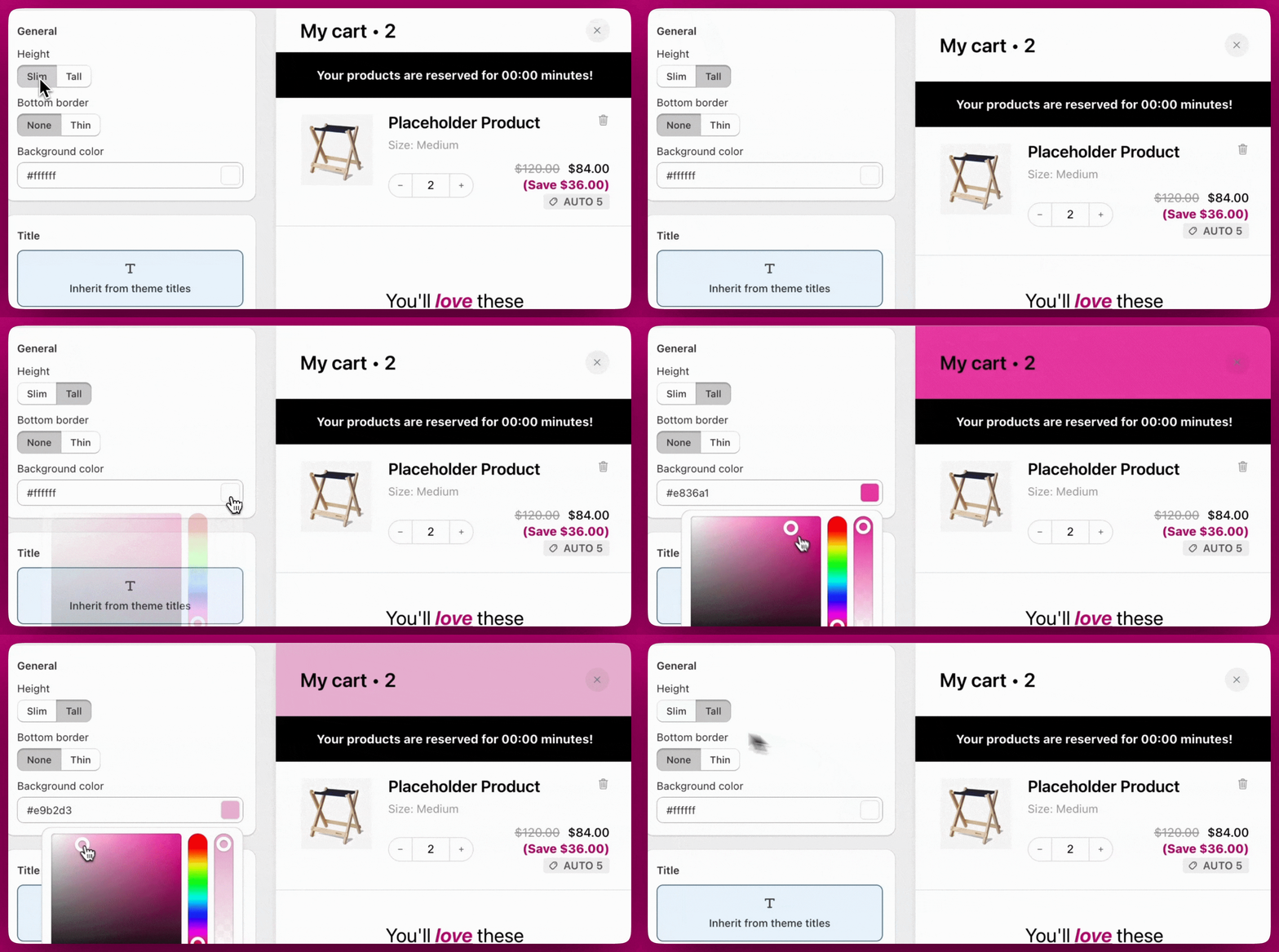
Title
There are three ways to define your cart drawer header title: inherit your theme’s default title styling, display your store’s logo, or create fully custom text styles. Each method offers flexibility depending on your design needs.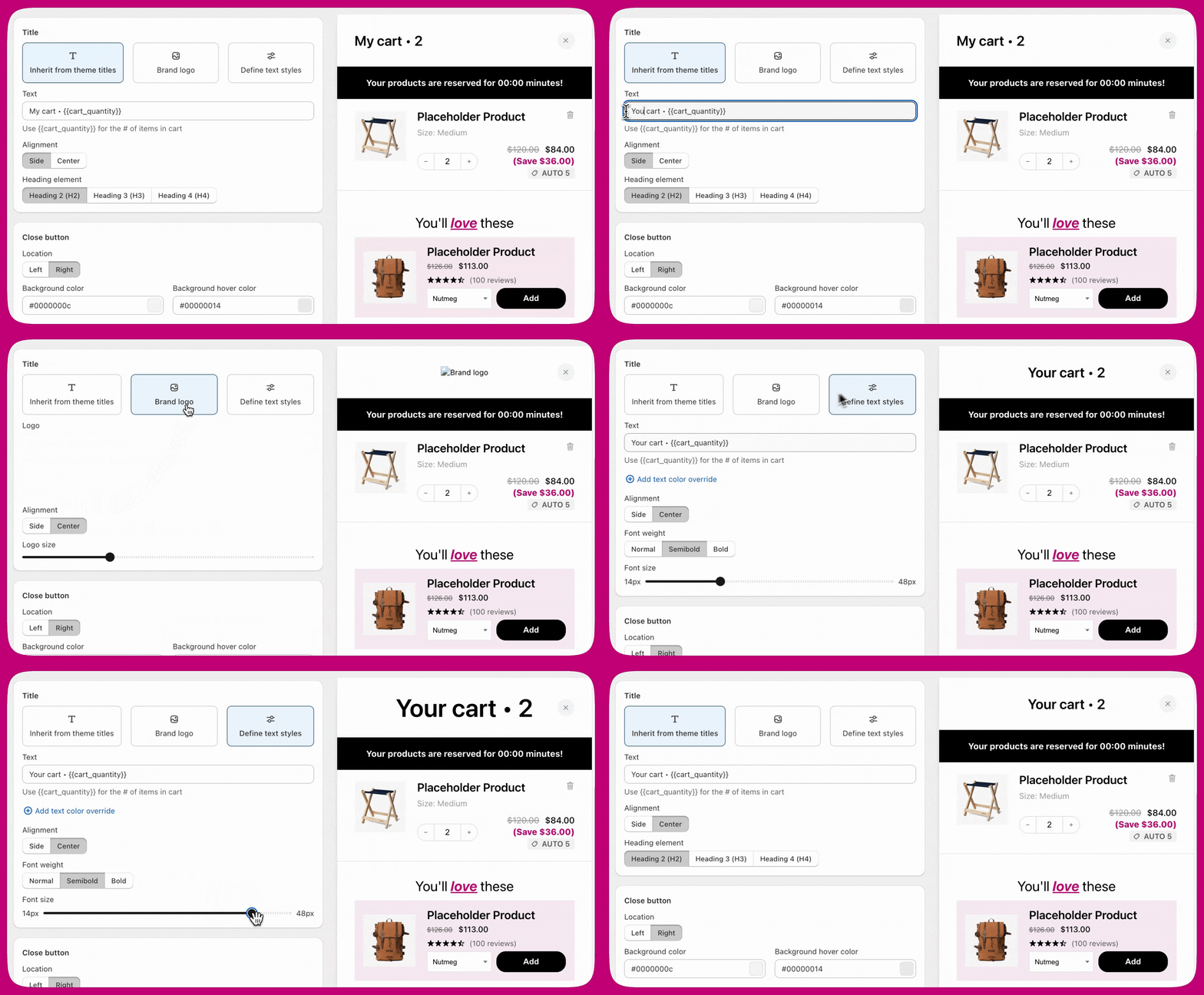
Inherit from Theme Titles
This option uses your theme’s default heading styles, helping you keep the design visually consistent with the rest of your site. You can add your own title using the Text field and dynamically include the number of cart items using{{cart_quantity}}. Text alignment can be set to Side or Center, and you can select the appropriate heading level H2, H3, or H4, based on your store’s content structure.
Brand Logo
If you prefer to use a brand logo in place of text, you can upload your store’s logo directly in this section. Choose to align the logo to the Side or Center, and scale it with the Logo size slider, which runs from 14 px to 48 px. There is no enforced limit on the file you upload, but using a PNG file is recommended for clean transparency and sharp edges. JPEGs are also supported but may include background noise or degrade logo detail. For performance, aim to keep file sizes optimized.- We recommend using a PNG file for best quality and support for transparent backgrounds.
- JPEGs work too, but may not look as clean, especially if your logo has a background or fine details.
Define Text Styles
Selecting the Text option gives you full control over styling the title independently from your store’s theme. You can enter any custom title and include{{cart_quantity}} for dynamic updates. Text alignment can be set to Side or Center, with options to change the font weight to Normal, Semibold, or Bold. Font size is adjustable from 14px to 48px using a visual slider, and you can optionally apply a text color override.
Close Button
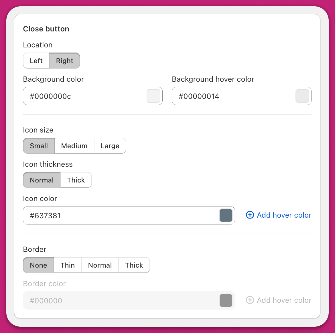
The close button is customizable to match your store’s design. Location puts it on the Left or Right side of the drawer. Background, Icon, and Border each take a colour plus a separate hover colour. Icon size is Small, Medium, or Large, and Icon thickness is Normal or Thick. Border is None, Thin, Normal, or Thick.The border colour and border hover colour fields are disabled while Border is set to None. Pick a border width first, then set its colours.
Custom template
On version 2.0 of the Header module, a Custom template code editor appears below the settings, with a single Full template covering the whole module. It uses React-based JSX, and you must first tick Access custom templates under Settings > Cart settings > Advanced Settings in the Cart Editor. See Setting up a custom template.Tips
- Want precise spacing or sizing? Use Custom CSS for full control beyond sliders, great for exact margins, padding, or logo scaling.
- Test on desktop and mobile. Header elements like text, logo, and buttons can display differently on various screen sizes
- Use proper heading levels. Choosing the right heading (H2, H3, H4) helps with accessibility and SEO. Match the structure of your store’s content.