⚠️ Important Notice
Custom templates require advanced technical knowledge of HTML, CSS, JavaScript, and React. Please ensure you have sufficient development expertise or access to a qualified Shopify developer before proceeding. Our support team will not provide assistance with custom template development, debugging, or troubleshooting. Technical questions should be directed to a Shopify expert or qualified developer.Code editor features
The custom template code editor includes built-in tools to help you write valid templates more easily.TypeScript IntelliSense
The editor understands TypeScript, so you get autocomplete suggestions, type-checking, and inline documentation for all availableprops as you type. The prop type hints are editor-only IntelliSense to help you write templates — they are not something you write into the template, and they never run on your storefront.
Editable template body
The editor exposes only the editable JSX body of your template — there are no locked lines. The surrounding function wrapper is added automatically at build time and is never shown in the editor. Use Reset to default at any time to restore the original template if your edits break the template structure.General Section
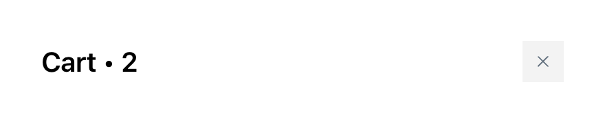
Header
The Header module allows you to customize the cart header with your own design while maintaining essential cart functionality like displaying item count and providing a close button.Available Props - Full template
cartQuantity
-
Type:
string - Description: The current number of items in the cart, formatted as a string
- Usage: Display the cart item count in your custom header design
closeHandler
-
Type:
() => void - Description: A callback function that closes the cart when triggered
- Usage: Attach to buttons, icons, or other interactive elements to close the cart
titleComponent
-
Type:
React.ReactElement | null - Description: A pre-rendered title component for the cart header that includes proper styling and translations
- Usage: Display the cart title based on your cart settings configuration
Body Section
Announcements
The Announcements module allows you to customize announcement displays with your own design while maintaining essential announcement functionality like timer controls and conditional visibility.Available Props - Full template

announcementTemplate
-
Type:
string - Description: The HTML content for the announcement message
- Usage: Display the announcement message in your custom implementations
timer
-
Type:
string - Description: The current timer value formatted as a string
- Usage: Display countdown timer in custom announcement implementations
shouldUseTimer
-
Type:
boolean - Description: Indicates whether the timer functionality is enabled for this announcement
- Usage: Conditionally render timer-related content and controls
isTimerExpiredAndShouldHide
-
Type:
boolean - Description: Indicates if the timer has expired and the announcement should be hidden
- Usage: Control the visibility of the entire announcement based on timer state
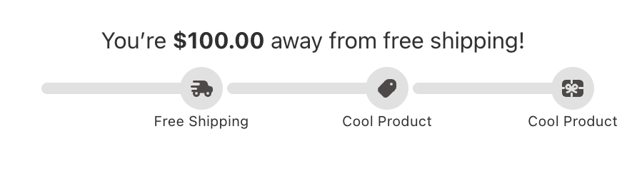
Tiered Rewards
The Rewards module allows you to customize reward progress displays with your own design while maintaining essential rewards functionality like milestone tracking, progress visualization, and reward messaging.Available Props - Full template
rewardsMessageHtml
-
Type:
string - Description: The HTML content for the rewards message
- Usage: Display the rewards message with rich formatting in custom implementations
milestonesCompleted
-
Type:
number - Description: The number of milestones that have been completed
- Usage: Display completion count or calculate completion percentage
milestonesData
-
Type:
- Description: Complete milestone configuration and progress data for the rewards system
- Usage: Access milestone information, progress percentage, and display settings
-
Properties:
milestonesToRender: Array of milestone objects with completion status and positioningprogressPercent: Current progress as a percentage (0-100)showMilestones: Whether to display milestone markerssettings: Visual configuration for milestone display
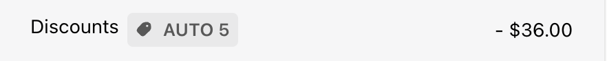
Discounts
The Discounts module supports custom templates so you can design your own display while keeping essential functionality like rule management, section visibility, and reward presentation. The internal module type identifier for custom templates isTRIGGERED_REWARDS for backward compatibility with existing custom template code.
Available Props - Full template
rules
-
Type:
- Description: Array of Discount rules that are currently enabled
- Usage: Display available rewards, their titles, descriptions, and whether each rule’s conditions have been met
-
Properties:
id: Unique identifier for the reward ruletitle: Title of the Discount ruledescription: Description of the reward ruleconditionsMet: Whether the rule’s conditions are currently satisfied by the cart. Use this to build “you’ve unlocked X” vs “spend $Y more to unlock X” UX patterns
showSection
-
Type:
boolean - Description: Indicates whether the Discounts section should be displayed
- Usage: Control the visibility of the entire Discounts module
onToggleSection
-
Type:
() => void - Description: A callback function that toggles the visibility state of the Discounts section
- Usage: Attach to buttons or interactive elements to allow users to show/hide the rewards section
Recommendations
The Recommendation module allows you to customize upsell product displays with your own design while maintaining essential e-commerce functionality like variant selection, add-to-cart actions, and product information display.Available Props - Recommendation tile template

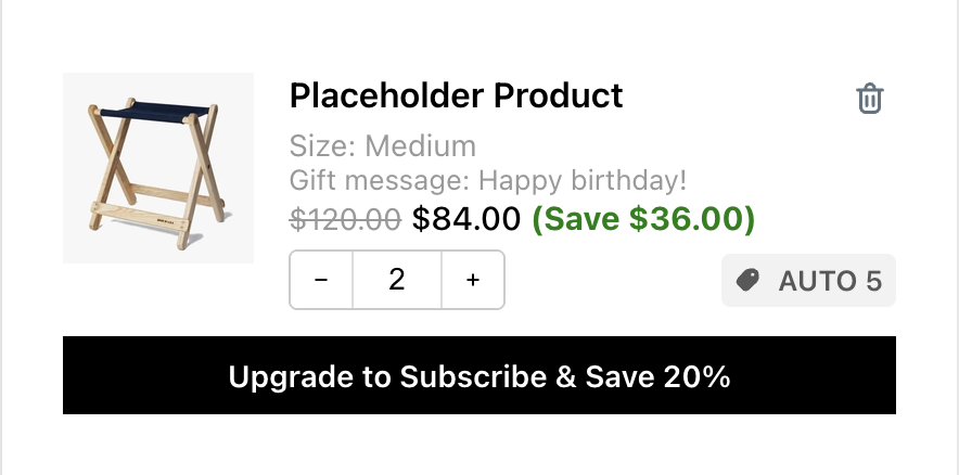
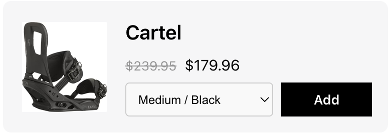
Cart Items
The Cart Items module allows you to customize cart item displays with your own design while maintaining essential e-commerce functionality. This module provides multiple template types, each with their own specific props for different aspects of cart item display.Showing a loading indicator during add-to-cart or cart updates: The standard Cart Items module does not expose a built-in “adding to cart” spinner. If you want to display a loading state while an item is being added or a cart operation is in progress, use the Product tile template and read the
isLoading and loadingOperation props (documented below) to conditionally render a spinner or overlay. Custom templates require developer experience — see the notice at the top of this page.Available Props - Product tile template
Note: Enabling the Product Tile template will override all other templates in this module, including Variant template, Properties template, Bundle template, and Price template.If you want to use custom code in any of those templates, you must turn off the Product Tile template.
title
-
Type:
string - Description: The product title/name
- Usage: Display the main product name in cart items
variant
-
Type:
React.ReactNode - Description: Pre-rendered variant information component
- Usage: Display variant details as a React component
properties
-
Type:
React.ReactNode - Description: Pre-rendered product properties component
- Usage: Display product properties and subscription info as a React component
bundle
-
Type:
React.ReactNode - Description: Pre-rendered bundle details component
- Usage: Display bundle information as a React component
compareAtPrice
-
Type:
string | undefined - Description: Formatted compare-at price (original price)
- Usage: Display original price for sale items
price
-
Type:
string - Description: Formatted current price
- Usage: Display the current item price
savings
-
Type:
string | undefined - Description: Formatted savings amount
- Usage: Display how much the customer saves
imageUrl
-
Type:
string | undefined - Description: Product image URL
- Usage: Display product image
productUrl
-
Type:
string | undefined - Description: Product page URL
- Usage: Link to product detail page
quantity
-
Type:
number - Description: Current item quantity in cart
- Usage: Display and manage item quantity
showQuantitySelector
-
Type:
boolean - Description: Whether to show quantity controls
- Usage: Conditionally display quantity selector
discountCodes
-
Type:
string[] | undefined - Description: Array of applied discount codes for this item
- Usage: Display item-specific discounts
subscription
-
Type:
- Description: Complete subscription management object with upgrade data, selling plans, and handler functions
- Usage: Manage subscription functionality
-
The subscription object contains:
-
subscriptionUpgradeData: Upgrade information (null if no upgrade available)
buttonText: Text for the upgrade buttondefaultSellingPlanId: ID of the default selling plan for upgrades
-
sellingPlansData: Available selling plan options (null if no plans)
sellingPlanGroups: Array of plan groups with their selling plansactiveSellingPlanId: Currently selected selling plan IDoneTimePurchaseText: Text for one-time purchase option (null if not available)
- upgradeSellingPlan: Function to upgrade to a specific selling plan
- changeSellingPlan: Function to change the current selling plan
- getSellingPlanGroupText: Utility function to format selling plan display text
-
subscriptionUpgradeData: Upgrade information (null if no upgrade available)
onIncrease
-
Type:
() => void - Description: Function to increase item quantity
- Usage: Handle quantity increase actions
onDecrease
-
Type:
() => void - Description: Function to decrease item quantity
- Usage: Handle quantity decrease actions
onDeleteProduct
-
Type:
() => void - Description: Function to remove item from cart
- Usage: Handle item removal
onQuantityChange
-
Type:
(quantity: string) => void - Description: Function to handle direct quantity input
- Usage: Handle manual quantity changes
handleInputChange
-
Type:
(e: React.ChangeEvent<HTMLInputElement>) => void - Description: Input change handler for quantity field
- Usage: Handle quantity input field changes
replaceItemWithVariant
-
Type:
(variantId: string) => Promise<{ success: boolean }> - Description: Function to replace item with different variant
- Usage: Handle variant switching
isLoading
-
Type:
boolean - Description: Loading state for cart operations
- Usage: Show loading indicators
loadingOperation
-
Type:
'increase' | 'decrease' | 'inputChange' | 'remove' | 'subscription' | undefined - Description: Specific operation currently loading
- Usage: Show operation-specific loading states
setLoadingOperation
-
Type:
(op: "increase" | "decrease" | "inputChange" | "remove" | "subscription" | undefined) => void - Description: Function to set loading operation state
- Usage: Manage loading states for different operations
rawItem
-
Type:
CartItem(Refer to theCartItemtype below) - Description: Raw cart item data containing all information
Available Props - Variant template

item
-
Type:
CartItem(Refer to theCartItemtype below) - Description: Raw cart item data containing variant information
- Usage: Access variant details from the cart item
Available Props - Properties template

productProperties
-
Type:
{ key: string; value: string; isUrl?: boolean; }[] - Description: Array of product properties (custom fields, line item properties)
subscriptionLabel
-
Type:
string | undefined - Description: Label for subscription information
Available Props - Bundle template
getSizedImageUrl
-
Type:
getSizedImageUrl: ({ src, width, height }: SizedImageParams) => string - Description: Utility function to get properly sized image URLs
item
-
Type:
-
Description: Bundle item information including components.
itemComponentsis an array of component objects — map over it to render each bundled component.
showDetailsText
-
Type:
string | undefined - Description: Text for “show details” action
- Usage: Display expand button text
hideDetailsText
-
Type:
string | undefined - Description: Text for “hide details” action
isExpanded
-
Type:
boolean - Description: Whether bundle details are expanded
toggleCollapsible
-
Type:
() => void - Description: Function to toggle bundle details visibility
- Usage: Handle expand/collapse actions
chevronDownIconComponent
-
Type:
React.ReactElement - Description: Pre-rendered chevron icon for expand/collapse
- Usage: Display consistent expand/collapse indicator
Available Props - Price template
compareAtPrice
-
Type:
string | undefined - Description: Formatted compare-at price (original price)
- Usage: Display original price for sale items
price
-
Type:
string - Description: Formatted current price
- Usage: Display the current item price
savings
-
Type:
string | undefined - Description: Formatted savings amount
- Usage: Display how much the customer saves
CartItem Object Properties
TheCartItem object contains all the detailed information about a cart line item. This object is available as props.rawItem in the Product Tile template and props.item in the Variant template.
Core Identification
-
key (string)- Unique identifier for this cart item. -
id (number)- Variant ID (legacy field, use variant_id instead) -
variant_id (number)- The Shopify variant ID for this item -
product_id (number)- The Shopify product ID -
lineIdxFrom1 (number)- 1-based index of this item in the original cart before modifications
Product Information
-
title (string)- The line item title (usually variant title) -
product_title (string)- The main product title -
handle (string)- Product URL handle (e.g., “camp-stool”) -
vendor (string)- Product vendor/brand name -
product_type (string)- Product category/type for tax purposes -
sku (string)- Stock Keeping Unit identifier -
product_description (string)- Full product description -
product_has_only_default_variant (boolean)- Whether the product has only one variant
Pricing (All prices in cents)
-
quantity (number)- Number of this item in the cart -
price (number)- Unit price before discounts -
original_price (number)- Same as price -
discounted_price (number)- Unit price after product-level discounts -
compare_at_price (number | null)- Compare-at price (MSRP). Note: This field is added by Upcart, not provided by Shopify’s cart API -
final_line_price (number)- Total price after product-level discounts (quantity × discounted_price) -
original_line_price (number)- Total price before discounts (quantity × price) -
line_price (number)- Total price after all discounts -
final_price (number)- Deprecated - Unit price after product discounts (doesn’t account for quantity) -
total_discount (number)- Same as line_level_total_discount -
line_level_total_discount (number)- Total discount amount applied to this line item
Media & URLs
-
image (string)- Primary product image URL -
url (string)- Relative URL path to the product page (e.g., “/products/camp-stool?variant=42789611372803”) -
featured_image (object | null)- Featured image details:alt (string)- Image alt textaspect_ratio (number)- Image aspect ratioheight (number)- Image height in pixelsurl (string)- Image URLwidth (number)- Image width in pixels
Variants & Options
-
variant_title (string | null)- Variant title (e.g., “Large / Red”) -
variant_options (string[])- Array of variant option values -
options_with_values (Array)- Detailed option information:name (string)- Option name (e.g., “Size”)value (string)- Option value (e.g., “Large”)
-
untranslated_product_title (string | undefined)- Original product title before translation (cart mutation responses only) -
untranslated_variant_title (string | undefined)- Original variant title before translation (cart mutation responses only)
Custom Properties & Metadata
-
properties (Record<string, any> | null)- Custom line item properties. Properties with keys starting with "" or "" are typically hidden from customers -
gift_card (boolean)- Whether this item is a gift card -
taxable (boolean)- Whether this item is subject to tax -
requires_shipping (boolean)- Whether this item requires shipping -
grams (number)- Item weight in grams
Discounts & Promotions
-
discounts (Array)- Simplified discount information:amount (number)- Discount amount in centstitle (string)- Discount title/name
-
line_level_discount_allocations (Array)- Detailed discount allocation information:-
amount (number)- Discount amount in cents -
discount_application (object)- Full discount application details:allocation_method (string)- How discount is allocatedcreated_at (string)- When discount was createddescription (string | null)- Discount descriptionkey (string)- Discount key identifiertarget_selection (string)- What the discount targetstarget_type (string)- Type of targettitle (string)- Discount titletotal_allocated_amount (number)- Total amount allocatedtype ('discount_code' | '')- Discount type (empty string for automatic discounts)value (string)- Discount valuevalue_type (string)- How value is applied
-
Bundle Products
-
has_components (boolean | undefined)- Whether this item is a bundle containing other products (GET cart responses only) -
item_components (Array | null | undefined)- Bundle component details:-
quantity (number)- Quantity of this component -
image (object)- Component image:url (string)- Image URLheight (number | null)- Image heightwidth (number | null)- Image widthalt (string)- Alt text
-
-
product (object)- Component product info:title (string)- Product titlehas_only_default_variant (boolean)- Whether product has only default variant
-
variantTitle (string)- Component variant title
Business Rules
-
quantity_rule (object | undefined)- Quantity constraints (GET cart responses only):min (number)- Minimum allowed quantitymax (number | null)- Maximum allowed quantity (null = no limit)increment (number)- Quantity increment step
Subscription Information
-
selling_plan_allocation (object | undefined)- Subscription/selling plan details:-
price (number)- Subscription price in cents -
compare_at_price (number | null)- Subscription compare-at price -
per_delivery_price (number)- Price per delivery -
selling_plan (object)- Selling plan details:-
id (number)- Selling plan ID -
name (string)- Plan name -
description (string)- Plan description -
options (Array)- Plan options:name (string)- Option nameposition (number)- Option positionvalue (string)- Option value
-
recurring_deliveries (boolean)- Whether plan has recurring deliveries
-
-
Integration Metadata
-
__appIntegrated (object | undefined)- Third-party app integration data:app ('stay.ai')- Integrated app identifierbundleRole ('parent' | 'child')- Role in bundle structure
Upsells
The Upsells module allows you to customize upsell product displays with your own design while maintaining essential e-commerce functionality like variant selection, add-to-cart actions, and product information display.Available Props - Upsell tile template
itemUrl
-
Type:
string - Description: The URL of the product page
- Usage: Create links to the product detail page for enhanced user navigation
imageUrl
-
Type:
string | undefined - Description: The URL of the product image
- Usage: Display product images in custom upsell implementations
- Fallback: Handle undefined values gracefully with placeholder images
description
-
Type:
string - Description: The description of product
- Usage: Display product description in custom upsell implementations
altText
-
Type:
string - Description: Alt text for the product image for accessibility
- Usage: Provide screen reader support and improve accessibility compliance
productId
-
Type:
string - Description: The unique identifier for the product
- Usage: Track products, implement analytics, or use in add-to-cart functionality
productTitle
-
Type:
string - Description: The title/name of the product
- Usage: Display the product name in custom upsell implementations
oldPrice & newPrice
-
Type:
string | null(oldPrice),string(newPrice) - Description: Formatted compare-at price and current price
- Usage: Display pricing information with sale indicators
isSingleVariant
-
Type:
boolean - Description: Indicates if the product has only one variant
- Usage: Conditionally render variant selection UI elements
productOptions
-
Type:
{ name: string; position: 1 | 2 | 3; values: string[]; }[] - Description: Complete product option configuration including all available choices
- Usage: Access detailed product option information for advanced variant selection UI
variantOptions
-
Type:
{ label: string; value: string }[] - Description: Available variant options for the product
- Usage: Create variant selection dropdowns or buttons
- Structure: Each option contains a display label and unique value identifier
selectedVariantId & selectedVariantLabel
- Type: string (selectedVariantId), string | undefined (selectedVariantLabel)
- Description: Currently selected variant ID and its display label
- Usage: Track and display the selected variant information
onVariantChange
-
Type:
(variantId: string) => void - Description: Function to handle variant selection changes
- Usage: Update the selected variant when user makes a selection
onAddClick
-
Type:
(productId: string, variantId?: string) => void - Description: Function to handle adding the product to cart
- Usage: Implement add-to-cart functionality with proper product and variant identification
rating & reviewCount
-
Type:
number | undefined(rating),string | undefined(reviewCount) - Description: Product rating and formatted review count text
- Usage: Display social proof and product quality indicators
addLoading & addButtonText
-
Type:
boolean(addLoading),string(addButtonText) - Description: Loading state for add-to-cart action and button text
- Usage: Provide user feedback during cart operations and customize button text
cartItemsCount
-
Type:
number - Description: The current number of items in the cart
- Usage: Display cart status or implement cart-based logic
Additional Notes
The Notes module allows you to customize cart note functionality with your own design while maintaining essential note-taking capabilities like expandable sections, text input handling, and loading states.Available Props - Full template
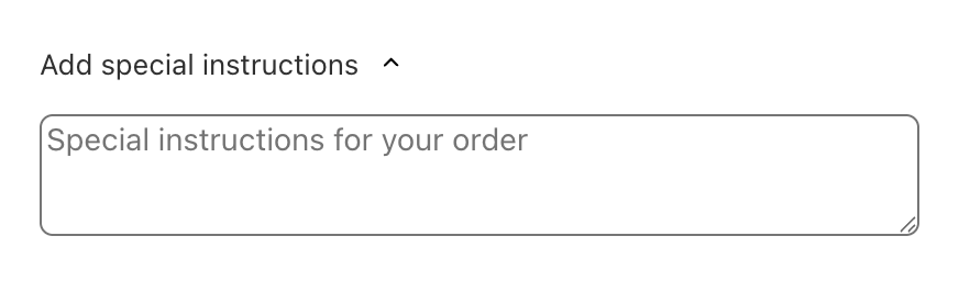
cartNote
-
Type:
string - Description: The current cart note content entered by the customer
- Usage: Display and manage the cart note text in custom implementations
notesPlaceholder
-
Type:
string - Description: Placeholder text for the notes input field
- Usage: Provide guidance to customers about what to include in their notes
notesTitle
-
Type:
string - Description: The title/header text for the notes section
- Usage: Display the section title in custom note implementations
chevronDownIconComponent
-
Type:
React.ReactElement - Description: Pre-rendered chevron icon component for expand/collapse functionality
- Usage: Display consistent expand/collapse indicators in custom implementations
loadingIndicatorComponent
-
Type:
React.ReactElement | null - Description: Pre-rendered loading indicator component for async operations
- Usage: Display loading states during note save operations
handleCartNoteChange
-
Type:
(newCartNote: string) => void - Description: Function to handle cart note content changes
- Usage: Update the cart note when user modifies the text
isExpanded
-
Type:
boolean - Description: Indicates whether the notes section is currently expanded
- Usage: Control the visibility of the notes input area
toggleCollapsible
-
Type:
() => void - Description: Function to toggle the expanded/collapsed state of the notes section
- Usage: Attach to buttons or interactive elements to control section visibility
Footer Section
Add-ons
The Addons module allows you to customize addon product displays with your own design while maintaining essential e-commerce functionality like product information display, pricing, toggle controls, and currency formatting.Available Props - Full template
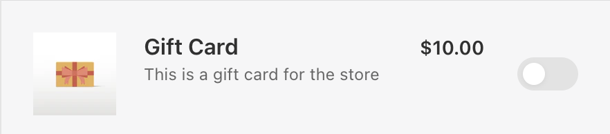
addonProduct
-
Type:
- Description: Complete addon product information including product details, variant pricing, and image data
- Usage: Access all product information needed to display addon products
-
Structure: Contains nested product, variant, and image objects with comprehensive product data
-
Product Object Properties
addonProduct.product- id: Unique numeric identifier for the product
- title: Display name of the addon product
- description: HTML description content of the product
-
Variant Object Properties
- id: Unique numeric identifier for the variant
- price: Current price in cents
- compare_at_price: Original price in cents (null if no comparison price)
-
Image Object Properties
- src: URL of the product image
- alt: Alt text for the image (for accessibility)
-
Product Object Properties
toggle
-
Type:
- Description: Toggle control state and handlers for enabling/disabling the addon
- Usage: Implement interactive toggle functionality for addon selection
- States: Three possible states - enabled, disabled, and loading
- Handlers: Separate functions for enable and disable actions
moneyFormat
-
Type:
string - Description: The currency format string used for price formatting
- Usage: Pass to the formatMoney function for consistent currency display
formatMoney
-
Type:
- Description: Utility function for formatting currency values
- Usage: Format prices consistently with store currency settings
- Parameters: Takes cents value, optional format string, and HTML removal option
Discount Codes
The Discount Code module allows you to customize discount code input functionality with your own design while maintaining essential e-commerce capabilities like code validation, form submission, and user feedback.Available Props - Full template

indicator
-
Type:
'validating' | 'invalid' | 'none' - Description: Current validation state of the discount code input
- Usage: Display appropriate UI feedback based on validation status
-
States:
validating: Code is being processed/validatedinvalid: Code validation failednone: No validation state (default/idle)
discountCodeInput
-
Type:
string - Description: Current value of the discount code input field
- Usage: Display and manage the discount code text entered by the user
discountCodePlaceholder
-
Type:
string - Description: Placeholder text for the discount code input field
- Usage: Provide guidance to users about what to enter in the input
discountCodeButtonText
-
Type:
string - Description: Text to display on the apply/submit button
- Usage: Customize the button text for discount code submission
setDiscountCodeInput
-
Type:
(value: string | ((prev: string) => string)) => void - Description: Function to update the discount code input value
- Usage: Handle user input changes in the discount code field
handleSubmit
-
Type:
(e: React.FormEvent<HTMLFormElement>) => void - Description: Function to handle form submission for discount code application
- Usage: Process discount code validation and application
- Event: Handles form submission events
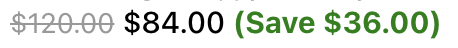
Cart Summary
The Cart Summary module allows you to customize cart summary and discount displays with your own design while maintaining essential e-commerce functionality like discount management, savings calculation, and pricing transparency.Available Props - Full template
totalSavingsText
-
Type:
string - Description: Text label for the total savings section
- Usage: Display the savings label in custom cart summary implementations
discountApplications
-
Type:
- Description: Array of applied discount codes and automatic discounts
- Usage: Display all active discounts with their titles and types
- Structure: Each discount contains a unique key, display title, and type identifier
cartTotalDiscount
-
Type:
number - Description: The total discount amount in cents
- Usage: Access raw discount value for calculations or custom formatting
showCartTotalDiscount
-
Type:
boolean -
Description: Deprecated — use
showTotalSavingsinstead. Indicates whether the total discount should be displayed - Usage: Conditionally render discount information based on settings
formattedCartTotalDiscount
-
Type:
string -
Description: Deprecated — use
formattedTotalSavingsinstead. Pre-formatted HTML string of the total discount amount - Usage: Display properly formatted discount amount with currency symbols
showTotalSavings
-
Type:
boolean - Description: Indicates whether the total savings row should be displayed, respecting the savings-row behaviour setting
- Usage: Conditionally render the total savings row based on the module’s savings-row behaviour setting
formattedTotalSavings
-
Type:
string - Description: Pre-formatted string of the total savings amount, respecting the savings-row behaviour setting
- Usage: Display the properly formatted total savings amount with currency symbols
isRemovingDiscount
-
Type:
boolean - Description: Indicates if a discount removal operation is in progress
- Usage: Show loading states during discount removal
handleRemoveDiscount
-
Type:
() => Promise<void> - Description: Function to handle discount code removal
- Usage: Remove applied discount codes from the cart
totalCompareAtPrice
-
Type:
number - Description: Total compare-at price adds up (all items in the cart)
- Usage: Calculate and display savings or original pricing information
totalAfterAllDiscounts
-
Type:
number - Description: Final cart total in cents after all discounts are applied
- Usage: Display the final price customers will pay
originalTotalPrice
-
Type:
number - Description: Original cart total in cents before any discounts
- Usage: Show original pricing for transparency and savings calculation
cartItemCount
-
Type:
number - Description: Total number of items in the cart
- Usage: Display item count information in cart summaries
Trust Badges
The Trust Badges module allows you to customize trust badge displays with your own design while maintaining essential trust-building functionality like conditional badge visibility and proper image handling.Available Props - Full template
showBadge
-
Type:
boolean - Description: Indicates whether the trust badge should be displayed
- Usage: Control the visibility of trust badges based on module settings
badgeUrl
-
Type:
string - Description: The URL of the trust badge image to display
- Usage: Source URL for the trust badge image in custom implementations